Showing posts with label Film Poster. Show all posts
Showing posts with label Film Poster. Show all posts
Wednesday, 28 January 2015
My Response to Audience Feedback: Poster Campaign
A brief video simply covering the audience feedback I received regarding my film and some initial improvements that I could have made based on the feedback given:
Thursday, 22 January 2015
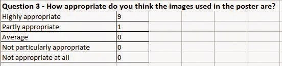
Audience Feedback: Poster Campaign Survey Responses
From the survey I sent out to my target audience, I received the following responses:


I then used Microsoft Excel to create graphs and charts for the results from questions 1 to 9 as a clear visual representation of my audience feedback:


I then used Microsoft Excel to create graphs and charts for the results from questions 1 to 9 as a clear visual representation of my audience feedback:
Wednesday, 21 January 2015
Audience Feedback: Poster Campaign Survey
As a way of gaining audience feedback regarding my poster campaign, I created a brief survey to gain some initial responses as well as any improvements.
Thursday, 1 January 2015
Poster for my short film
After researching, designing, creating and editing several 'trial' posters for my short, I have finally decided on the poster I would like to use to officially advertise my short film:


I decided on this poster to represent my short film as I feel it displays clearly what my short is about, clearing showing both sides and encouraging the potential audience to question whether their teenager years were the best years of their life, or not. I feel the posters are creative and clearly display a divide between the most stressful and most enjoyable aspects of teenage life with both the images within the thought bubble and the next below it clearly demonstrating this. The text and photos are clear and the idea of the poster can easily be understood by the potential audience given their size.
I decided on this poster to represent my short film as I feel it displays clearly what my short is about, clearing showing both sides and encouraging the potential audience to question whether their teenager years were the best years of their life, or not. I feel the posters are creative and clearly display a divide between the most stressful and most enjoyable aspects of teenage life with both the images within the thought bubble and the next below it clearly demonstrating this. The text and photos are clear and the idea of the poster can easily be understood by the potential audience given their size.
Tuesday, 2 December 2014
Poster for my short film based on idea of typography
Based on the idea presented by the What's Your Number and 27 Dresses poster campaigns of using typography as a method of presenting information regarding the film as a 'teaser' poster, I created a sample posters for my own short film drawing upon different aspects of teenage life:

The poster presents a student reading a book with the shape of book being filled with words that can be associated with being a teenager and growing up, for example, drinking, university, stress and freedom.
Friday, 28 November 2014
Poster for my short film based on idea of divison
Based on the idea presented by the Valentine's Day poster campaign of including a split between the main focus of the film and displaying the two sides as 'teaser' posters, I created two posters for my own short film drawing upon the different aspects of teenage life which are focused upon in my short film:
Whilst filming for my short film, I also took the opportunity to take several photos which may have come in handy when creating my film poster, which I have ended up using in the posters above. The first poster presents a student in their uniform daydreaming about all the 'good' things about growing up including parties, hanging out with friends, learning to drive and leaving high school, memorable events which students will usually take part in and remember for life as major stepping stones in growing up. The second poster is almost a flip-side of the first, with the teenager in her school uniform also daydreaming, but about all the 'bad' things about growing up, including writing essays, sitting exams, revising and dealing with arguing parents, activities which most students will usually find difficult, time consuming and stressful.
Whilst filming for my short film, I also took the opportunity to take several photos which may have come in handy when creating my film poster, which I have ended up using in the posters above. The first poster presents a student in their uniform daydreaming about all the 'good' things about growing up including parties, hanging out with friends, learning to drive and leaving high school, memorable events which students will usually take part in and remember for life as major stepping stones in growing up. The second poster is almost a flip-side of the first, with the teenager in her school uniform also daydreaming, but about all the 'bad' things about growing up, including writing essays, sitting exams, revising and dealing with arguing parents, activities which most students will usually find difficult, time consuming and stressful.
Wednesday, 26 November 2014
Poster for my short film based on idea of a collage
Based on the idea presented by the 'Valentines Day' and 'Love Actually' poster campaigns (see here: http://beckieeturnera2media.blogspot.co.uk/2014/12/collage-poster-campaigns.html) of including each individual main character, I created a sample poster for my own short film drawing upon different aspects of teenage life:

The poster presents different aspects of growing up, from arguing with parents to prom and from revising to going on holiday without parents in a collage format, giving the audience an initial idea of what to expect from the film regarding what footage will be seen.
The poster presents different aspects of growing up, from arguing with parents to prom and from revising to going on holiday without parents in a collage format, giving the audience an initial idea of what to expect from the film regarding what footage will be seen.
Monday, 24 November 2014
Poster for my short film based on idea of individual teaser posters
Based on the idea presented by the Les Mis poster campaign of including each individual main character as a 'teaser' poster, I created two sample posters for my own short film drawing upon different aspects of teenage life:


The first poster presents a student studying for their exams, an activity which most students will usually find difficult and time consuming. The second displays memories from a high school 'leavers' day, a very memorable event which many students will take part in and remember for life as a major stepping stone in growing up. The background is of a corkboard with the photos being lined with a polaroid frame, implying that the photos will remain as memories on the teenagers' corkboard of life.
Thursday, 20 November 2014
Poster ideas based on idea of using a collage
Based on the idea of using a collage to advertise a film that links to the actors and/or themes within the film, as shown in Valentine's Day and Love Actually, I (very roughly) created a poster as can be seen below:

As you can see from the photo above, the poster will include a series of photos consisting of the best and worst things about growing up and being a teenager with the title across the middle. The idea of this is to encourage potential audiences to weigh up the experiences of their youth and decide for themselves if their teenage years were the best years of their lives or not.
As you can see from the photo above, the poster will include a series of photos consisting of the best and worst things about growing up and being a teenager with the title across the middle. The idea of this is to encourage potential audiences to weigh up the experiences of their youth and decide for themselves if their teenage years were the best years of their lives or not.
Collage poster campaigns

The poster campaigns such as 'Valentine's Day' and 'Love Actually' use a collage technique in order to advertise their films. In the poster on the top-left, the title is much clear than on the poster in the top right, making the title equally as focused upon as the photos. The photos show each of the characters within the film, giving the audience an immediate insight into the film and what to expect from the actors featuring in it. However, the poster shows no release date, so this could mean either the film has already been released or the poster emerged long before the release date.
In the poster on the top-right, the photos make up a collage effect where there is a photo of each different actor/actress who plays a main role within the film. The title is not fully clear as the potential audience really have to focus to separate the letter from the background image in some cases.
The poster in the bottom-left shows the actors featured in the film in a collage within the shape of a heart, emphasising the topic of love and Valentine's Day, directly linking to the film. The actors names are listed below the heart shape are coloured based on their gender: with blue font of the male actors, and the pink font used for the female characters.
In the poster for 'Love Actually', the same theme of a collage is used to show the main actors within the film with the red ribbon and use of snow emphasising the idea of a Christmas setting with the title clearly positioned at the bottom of the page, however, this does suggest it will be the last thing the potential audience look at.
Regarding ideas for my own collage-theme based poster, I would replace the idea of using photos of the actors and actresses with images of struggles and benefits of being a teenager, focusing upon the idea of weighing up the positive and negative aspects of growing up and being a teen.
Tuesday, 18 November 2014
Poster ideas based on idea of using typography
Based on the idea of using typography to advertise a film, as shown in '27 Dresses', 'One Love', 'The Words' and 'What's Your Number', I (very roughly) created a poster following a similar theme to focus upon weighing up the stressful and enjoyable experiences of being a teenager and growing up:

As you can see from the photo above, the poster will include a main image of a student reading a textbook relating to their studies, however, the inside of the textbook will be filled with words relating to being a teenager with the title featuring, in a much larger size, inside. The idea of the poster is to easily display the most important, stressful and memorable experiences of growing up.
Typography poster campaigns

The idea of using typography in poster campaigns can be seen as very effective in films such as '27 Dresses', 'One Love', 'The Words' and 'What's Your Number?'. In the top left poster, 'One Love', the use of symbols/icons that are typically associated with Bob Marley, the main focus of the film, such as peace signs, music notes, happiness and love which make up the outline of his head. In case the typography image is unclear to some audiences, or they struggle to connect the links displayed in the poster, at the bottom, 'Marley' is printed very clearly, with the release date below. The title is additionally very clear, separate from the image and relates directly to one of his most famous songs. The poster overall is very effective in the way it directly links to the associations to Bob Marley, the main focus of the film.
In the top-right, the poster for 'What's Your Number?', the use of typography is also used effectively. The main image makes up a heart through the use of numbers, directly linking to the title, with the heart shape suggesting a romantic genre. One of the main characters is also shown to be sitting on top of the heart and wearing red, further suggesting romance and passion. The title remains separate from the image with the word 'number' in red, again supporting the idea of romance. The poster overall is effective as it makes the use of the word 'number' in the title and the romantic genre to link the ideas together through a typography manner, clearly linking to the film itself.
The poster in the bottom-left is for the film '27 Dresses' and again uses the technique of typography to advertise the film. The outline of a wedding dress, supported by the shape and background colour of white, immediately relates to the title through the link of dresses. The title is a different colour and size from the rest of the text which makes it easy to read and differentiate from the rest of the text. The main character is also seen to be wearing the 'dress' creating an easy association for the audience. Overall, the poster is effective as the link between the title and the storyline with the poster is presented very clearly through the use of typography creating the shape of a wedding dress and immediately alerts the potential audience as to what the film may be about.
In the bottom-right is the poster for the film 'The Words' where the outline of one of the main characters, Bradley Cooper, is made up out of words that relate to the storyline of the film as a tease to the audience about the content. The title is separate from the image, and the use of the word 'Words' directly relates to the use of typography technique. The poster uses the technique of typography effectively by relating the title to the technique, by including the main character and by teasing the potential audience to the plot and content of the film using the words that make up the outline of Bradley Cooper.
Based on the use of typography to create the poster for my own short film, my initial idea would be the have the outline of a student studying, or another significant event or object, relating to teenager years which will be filled with all the words that people link/associate to being a teenager, which would in turn, also relate to my short film as it weighs up the positive and negative aspects of being a teenager and growing up.
Monday, 17 November 2014
Poster ideas based on idea of division
Based on the idea of using a divide to advertise a film that links together through a particular event, as shown in Valentine's Day I (very roughly) created two posters following a similar theme to focus upon weighing up the stressful and enjoyable experiences of being a teenager and growing up:


As you can see, the first poster focusses upon the best, and most enjoyable aspects of growing up. The image of a teenager, in their school uniform looking fed up will appear in the far right hand side of the poster with a thought bubble featuring photos, taken whilst filming, of arguably, all the best things about growing up, such as funfairs, visiting the beach, having fun with little responsibility. Beside the image of the student will be a list featuring some of the activities that featured within my film, such as holidays, gigs and leavers day. The title will appear below this lift with the other information regarding camera, sound, lighting, release date and hashtag, to encourage advertisement across social media.
An identical design will appear on the other poster, but focussing upon the worst and most stressful aspects of growing up and being a teenager. The image of the teenager in their school uniform will appear, flipped, in the far left of the poster, giving the impression the student is being split in two. The image of the thought bubble will also be flipped and filled with photos, taken during filming, that display, arguably the worst things about growing up, such as revision, filling out UCAS and struggling with issues regarding body image. Beside the image of the student will again be a list of the activities that feature within my film, such as homework, deciding on unis and bullying. Below this list will be the film title with other information regarding camera, sound, lighting, release date and hashtag to encourage advertisement across social media.
Valentine's Day poster campaign

The Valentine's Day poster campaign was used effectively to advertise the film by creating a realistic 'divide' that links to the film storyline. The posters mark a clear divide through separating the female and male actors, by changing the colour scheme to blue on the male poster and by changing the wording at the top. It's a stereotypical view that women take Valentine's Day more seriously than men do, hence the words associated with Valentine's Day, such as 'flowers', 'jewellery', 'cards' and 'what a day' featuring on the female poster, and the words ''work', 'trainer', 'ball game' and 'what day is it again?', emphasising the difference between the two genders and their views towards Valentine's Day, appealing to both genders opposed to the stereotypical female-based audience. The title of the film and the release date are both clear, large and bold to attract the attention of the potential audience. The collage of the actors is the centrepiece of each poster, and with their names listed alongside, it's easy for the potential audience to link names to faces, targeting those who are major fans of a particular actor in the film, encouraging them to watch it. For my own poster, I will use a similar technique to the divide one used in the Valentine's Day poster campaign, but use this to create a divide between the most stressful and more enjoyable experiences about being a teenager, rather than to separate gender. This idea will encourage the potential audience to weigh up their experiences as a teenager and decide for themselves whether they believe their teenage years were the best years of their life or not.
Friday, 14 November 2014
Poster ideas based on the use of silhouettes
Based on the idea of using silhouettes in teaser posters to advertise a film that all link together in a trio, as shown in Star Wars I (very roughly) created 2 ideas of themes I could focus on that feature within my film, as can be seen below:


As with the previous post on individual teaser poster campaigns, a main image will dominate each poster with an outline image of a student studying, what they should be doing, with an image of what they rather would be doing inside the outline, for example, going to the beach or just chilling with friends, with the title across above the textbook, in the centre. Another idea for a silhouette poster is the main image/outline of a student drinking, what they would like to be doing, with the image of what they should be doing, for example, revising and completing work, as the picture inside. The aim of each poster would be to highlight the main events or activities a teenager experiences whilst growing up, weighing up what they should be doing against what they would rather be doing, all contributing to the aim of the short film itself, to encourage teenagers to make the most of their youth instead of being stressed and constantly worrying, but also to spread their time equally between studying and relaxing.
As with the previous post on individual teaser poster campaigns, a main image will dominate each poster with an outline image of a student studying, what they should be doing, with an image of what they rather would be doing inside the outline, for example, going to the beach or just chilling with friends, with the title across above the textbook, in the centre. Another idea for a silhouette poster is the main image/outline of a student drinking, what they would like to be doing, with the image of what they should be doing, for example, revising and completing work, as the picture inside. The aim of each poster would be to highlight the main events or activities a teenager experiences whilst growing up, weighing up what they should be doing against what they would rather be doing, all contributing to the aim of the short film itself, to encourage teenagers to make the most of their youth instead of being stressed and constantly worrying, but also to spread their time equally between studying and relaxing.
Star Wars poster campaign

The Star Wars poster campaign for the films 'Episode I', 'Episode II', 'Episode III', was used very effectively to advertise the film through the use of a trio 'teaser' posters, focussing upon 3 recognisable characters within each film and also, arguably, the most memorable scene from each film. The first poster on the left advertises the first film and includes a shadow of a droid, a common figure within the first film with the memorable race scene. The second poster follows an identical design with the outline of a storm trooper, again a common figure throughout the film, with the scene of the battle inside, arguably, the most memorable scene from the movie. It is no surprise that the poster for the third film follows the same design with the outline of Darth Vader with the battle scene between two of the main characters. The idea of the trio of posters following the same design emphasises the links within the plot and leaves the poster campaign being easily recognisable. The view of the silhouette figures with scenes of the film inside them acts as teaser/sneak preview for those that had not seen the film, and as a familiar memory for those that previously already had.
Subscribe to:
Posts (Atom)