Showing posts with label Ancillary Task. Show all posts
Showing posts with label Ancillary Task. Show all posts
Wednesday, 28 January 2015
My Response to Audience Feedback: Magazine Article
A brief video simply covering the audience feedback I received regarding my film and some initial improvements that I could have made based on the feedback given:
My Response to Audience Feedback: Poster Campaign
A brief video simply covering the audience feedback I received regarding my film and some initial improvements that I could have made based on the feedback given:
Thursday, 22 January 2015
Audience Feedback: Magazine Article Survey Responses
From the survey I sent out to my target audience, I received the following responses:


I then used Microsoft Excel to create graphs and charts for the results from questions 1 to 9 as a clear visual representation of my audience feedback:


I then used Microsoft Excel to create graphs and charts for the results from questions 1 to 9 as a clear visual representation of my audience feedback:
Audience Feedback: Poster Campaign Survey Responses
From the survey I sent out to my target audience, I received the following responses:


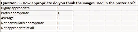


I then used Microsoft Excel to create graphs and charts for the results from questions 1 to 9 as a clear visual representation of my audience feedback:


I then used Microsoft Excel to create graphs and charts for the results from questions 1 to 9 as a clear visual representation of my audience feedback:
Wednesday, 21 January 2015
Audience Feedback: Magazine Article Survey
As a way of gaining audience feedback regarding my magazine article, I created a brief survey to gain some initial responses as well as any improvements.
Audience Feedback: Poster Campaign Survey
As a way of gaining audience feedback regarding my poster campaign, I created a brief survey to gain some initial responses as well as any improvements.
Audience Feedback: Film Survey
As a way of gaining audience feedback regarding my film, I created a brief survey to gain some initial responses as well as any improvements.
Thursday, 15 January 2015
Second Draft of my magazine article
From spending a lot of time looking at my first draft of my magazine article I became to dislike it more and more, believing there was too much text and it may bore the potential reader and they would simply skip the article. In this updated version I have removed some of the text and included another snapshot from the film, added a website URL and a twitter name to emphasise the interactive element and link to the use of a hashtag trend as seen on the poster, whilst changing the colour of the box around the 'inspiration' section to match the colour scheme, as can be seen below:
Thursday, 1 January 2015
Poster for my short film
After researching, designing, creating and editing several 'trial' posters for my short, I have finally decided on the poster I would like to use to officially advertise my short film:


I decided on this poster to represent my short film as I feel it displays clearly what my short is about, clearing showing both sides and encouraging the potential audience to question whether their teenager years were the best years of their life, or not. I feel the posters are creative and clearly display a divide between the most stressful and most enjoyable aspects of teenage life with both the images within the thought bubble and the next below it clearly demonstrating this. The text and photos are clear and the idea of the poster can easily be understood by the potential audience given their size.
I decided on this poster to represent my short film as I feel it displays clearly what my short is about, clearing showing both sides and encouraging the potential audience to question whether their teenager years were the best years of their life, or not. I feel the posters are creative and clearly display a divide between the most stressful and most enjoyable aspects of teenage life with both the images within the thought bubble and the next below it clearly demonstrating this. The text and photos are clear and the idea of the poster can easily be understood by the potential audience given their size.
Friday, 19 December 2014
First draft of my magazine article covering my short film
Combining the features and aspects from all the magazine articles I conducted research into, I finally created a magazine article reviewing my own short film, as can be seen below. The article splits the emphasis between images and text equally, whilst including an 'inspiration' feature to explain how I got the idea for my short, whilst additionally displaying QR codes to add an interactive element for readers!
Monday, 15 December 2014
Magazine article layout ideas based on Odeon magazine article
Based on the Odeon magazine article I created a rough plan for another magazine article:

Like with the Odeon article, the main image dominates the article with the film info shown over this image. However, on the opposite side, although the title of the article is displayed largely, the film title is also shown beneath with its tagline. The article itself is additionally split into two columns opposed to one, with the fact about the film in between the two.
Like with the Odeon article, the main image dominates the article with the film info shown over this image. However, on the opposite side, although the title of the article is displayed largely, the film title is also shown beneath with its tagline. The article itself is additionally split into two columns opposed to one, with the fact about the film in between the two.
Odeon Magazine Article
Odeon also produce a film-based magazine and an example of an article can be seen below:

The main image dominates the page massively, taking up the whole of the double-page spread, with the words 'coming soon' largely featuring at the top. The image displays two of the main characters and the readers are almost expected to know the link between them and the film saga itself. The title of the article and the tag line don't even mention the title of the film but directly relates to it, with the title being displayed in the bottom right-hand corner with the release date, age certificate, director's name and main actors. The article itself briefly repeats what has happened in the previous films, before including quotes from an interview with the cast members and discussing the new film. A 'did you know' feature also appears on the spread and gives the readers some behind the scenes info on the new film.
The main image dominates the page massively, taking up the whole of the double-page spread, with the words 'coming soon' largely featuring at the top. The image displays two of the main characters and the readers are almost expected to know the link between them and the film saga itself. The title of the article and the tag line don't even mention the title of the film but directly relates to it, with the title being displayed in the bottom right-hand corner with the release date, age certificate, director's name and main actors. The article itself briefly repeats what has happened in the previous films, before including quotes from an interview with the cast members and discussing the new film. A 'did you know' feature also appears on the spread and gives the readers some behind the scenes info on the new film.
Friday, 12 December 2014
Magazine article layout ideas based on Total Film magazine article
Based on the two layouts/designs of the previous two Total Film articles, I have drawn up a very rough plan for an article:

The article features an extremely large image on the right-hand side, with features such as 'similar to' in the bottom right-hand corner, whereas on the opposite page, the title dominates the page with a star rating and the article separated by an emphasised quote taken directly from the article and an 'interest graph' to highlight the most thrilling parts of the film.
The article features an extremely large image on the right-hand side, with features such as 'similar to' in the bottom right-hand corner, whereas on the opposite page, the title dominates the page with a star rating and the article separated by an emphasised quote taken directly from the article and an 'interest graph' to highlight the most thrilling parts of the film.
Total Film Magazine Article
Below is another film-based article from the Total Film magazine:

The layout and design of this article is much the same as the previous one with a main image taking up the majority of the double-page spread, a running time/interest graph, age certificate, photo caption and film of the month feature.
The layout and design of this article is much the same as the previous one with a main image taking up the majority of the double-page spread, a running time/interest graph, age certificate, photo caption and film of the month feature.
Total Film Magazine Article
Total Film is also another very popular film-based magazine and an example of an article can be seen below:

Half of the double spread is taken up by a screenshot from the film which gives the reader a visual representation from the film and gives them a teaser of what to expect; the photo caption usually tells the reader what is going on in the image, however, in this example, the caption features a humorous twist, meaning it doesn't actually state what is actually happening in the image. In the bottom right-hand corner of the spread are further recommendations of similar films where the reader can find other films that may interest them. Also in this box is a link to their website, the magazine website and the page number. On the opposite page, the title is a very dominant feature and gives a star rating guide to match the critic's review. It is also clearly states that the film was given a movie of the month award. The magazine is original in its use of a running time/interest graph showing which parts were most thrilling, something I haven't seen in film magazines that I have previously researched. The article itself briefly describes and analyses the film from a critical point of view and even includes a short overview for those who may not have time to read the whole article. A direct quote has also been taken from the article and made vibrant to the reader to give them a brief feel of the point the article is attempting to get at. At the bottom of the article is also the information regarding the stars, age certificate, running time, distributor, director and screenplay.
Half of the double spread is taken up by a screenshot from the film which gives the reader a visual representation from the film and gives them a teaser of what to expect; the photo caption usually tells the reader what is going on in the image, however, in this example, the caption features a humorous twist, meaning it doesn't actually state what is actually happening in the image. In the bottom right-hand corner of the spread are further recommendations of similar films where the reader can find other films that may interest them. Also in this box is a link to their website, the magazine website and the page number. On the opposite page, the title is a very dominant feature and gives a star rating guide to match the critic's review. It is also clearly states that the film was given a movie of the month award. The magazine is original in its use of a running time/interest graph showing which parts were most thrilling, something I haven't seen in film magazines that I have previously researched. The article itself briefly describes and analyses the film from a critical point of view and even includes a short overview for those who may not have time to read the whole article. A direct quote has also been taken from the article and made vibrant to the reader to give them a brief feel of the point the article is attempting to get at. At the bottom of the article is also the information regarding the stars, age certificate, running time, distributor, director and screenplay.
Thursday, 11 December 2014
Magazine article layout ideas based on Sight & Sound magazine article
From the article from Sight and Sound magazine, I have very roughly designed the layout to an article which may inspire me on what aspects/features I may include in my own article as can be seen below:

The design consists of the film title and info at the top of the left page with the article itself divided by photos and a section dedicated to film/s similar to the focus of the article, with the magazine name and page number being positioned in the bottom right-hand corner.
The design consists of the film title and info at the top of the left page with the article itself divided by photos and a section dedicated to film/s similar to the focus of the article, with the magazine name and page number being positioned in the bottom right-hand corner.
Subscribe to:
Posts (Atom)